Some organizations may think they would need a separate data visualization software in addition to their M&E software. Fortunately, it is not the case with LogAlto! Our data visualization tool (Analytics module) allows you to analyze and aggregate data that was entered in LogAlto.
Key features of LogAlto’s data visualization tool:
Various data visualizations can be created:
![]()
![]()
![]()
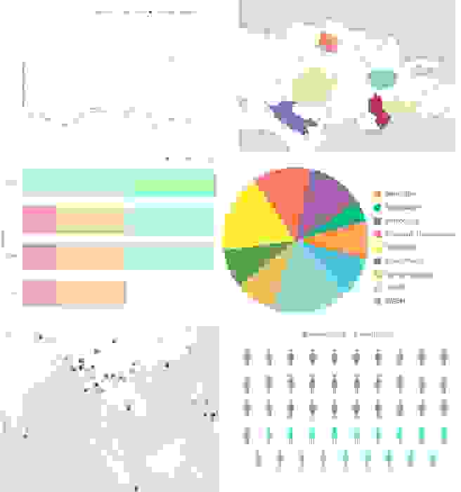
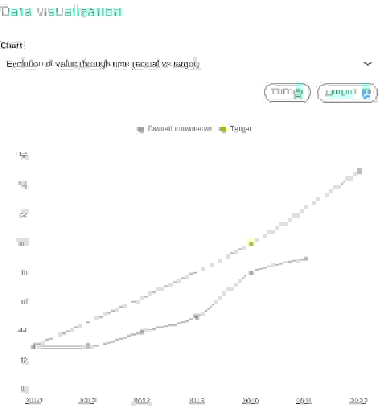
Some modules include pre-built data visualizations. For instance, in the logframe module, you can produce charts to visualize the progress of your indicators. This feature is especially useful for users that have not a lot of experience with data visualization tools.
Our data visualization tool can be used not only to analyze data related to your logframes – like indicator values – but also your project portfolio data, activities, progress reports or forms and surveys.
Calculations (sum, average, etc.) can be applied to numerical data, and categories (lists, genders, locations, projects) can be used as series and compared.
Any good data visualization software would be incomplete without the ability to aggregate data. LogAlto’s data visualization tool allows you to aggregate data on various levels. For instance, project data can be aggregated by sector, region, partner, etc. Indicator data or form records can be aggregated by gender, age group, etc.
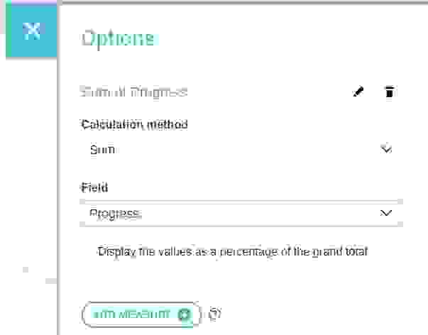
LogAlto’s data visualization tool allows you to configure each report by specifying:
![]()
Tables (grids) can be exported (downloaded) as Excel files and Charts can be exported as images. This is useful if you need the charts and tables created with the data visualization tool to be added to a word document.
![]()
The charts and tables created with the data visualization tool can be shared with other LogAlto users and placed on dashboards (global dashboard, user dashboard or project dashboard).
![]()
If LogAlto’s data visualization tool does not fit your needs, the Power BI integration allows you to aggregate and analyze data and create dashboards that can be embedded in LogAlto. It is also feasible to integrate LogAlto with another data visualization software.
Request a demo to learn more about how LogAlto can help your organization visualize its data.
Subscribe to our Quarterly Newsletter!